Wednesday 29 November 2023

All the Right Wrong Places

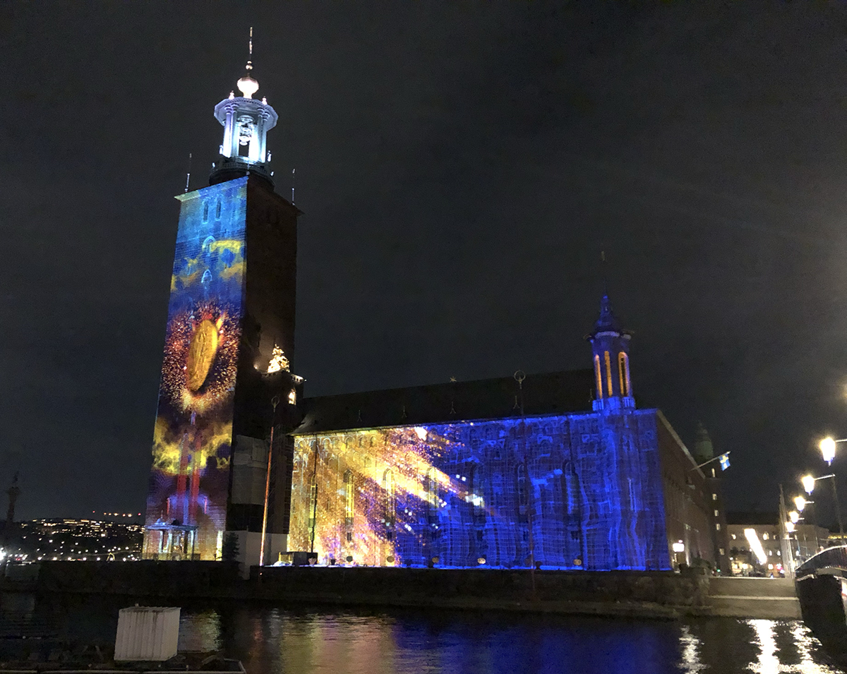
Lights on Romania elegantly demonstrates the meaning of venue for an artwork. 

Closer to You by Teodor Buruiană was not in a living room, which is great.


One of the things I have changed my mind about are touring light art works, showed in several festivals. I used to sneer at them, chuffing about unoriginality and copy-paste curating. Then it dawned to me that not everybody travels several light art festivals per year (or month) (week). It’s most likely the piece I’ve seen thrice the regular audience sees for the very first and only time. Also, it would be economically and ecologically stupid to build a possibly huge and expensive piece just for one show.

Also, venue matters. A lot. An artwork may change to an entirely different experience according to its location. This was elegantly demonstrated in Timișoara. Careful consideration of venues was one of the Lights On Romania festival’s perks. Let's see a few examples.

I do get my kicks from displaced objects. I'm sorry Luke Jerram's Gaia didn't make it to the festival, since it (and his Museum of the Moon) are my favourite examples of a basic thing becoming interesting by being in a totally wrong place. But here, I got a new approach to right / wrong places from Loomaland's swans of Electric Swan Ensemble

This is the closest I dared to go

I’ve seen the swans before in Berlin Light Festival, and I do admit it didn’t do much of an impression then. The swans were puddling in a shopping center’s geometrical pool, which is a wrong environment, I admit, but wrong in a wrong way. Also, the surrounding inflatable animals and overall hoodlum rendered the swans as showy toys. In Timișoara, however, the birds were in quite a natural habitat, swimming in the Bega river. And oh my, were they uncanny. Frightening, even. Now I paid more attention to movement of the androidic swans, which was amazingly naturelike. Not counting their ability to change colour, admittedly. The environment changed the artwork from a Tivoli decoration to an equivocal comment on nature, technology, future, and everything. At least for me.

The artwork was beautiful even with people in it

Another art piece elevated by environment was Squidshop’s Submergence. Last time I saw it in Jyväskylä WinterLight, in an indoors exhibition with several other artworks. It was nice then, yes, but seeing it in an derelict, roofless movie theatre was a totally different experience. The surrounding decay created a striking contrast to the tidy and premeditated twinkles of light. That kind of barren beauty just is not possible in a neutral environment. This was a playground no more, but an eerily beautiful, breathtakingly melancholic art installation.

Some light exercise


In Pavol Truben's Under Pressure, life sized characters with glowy heads nearly bursting of stress are desperately trying to relax via yoga-like poses. It would have been quite obvious to place the piece in a gym or an office. But no, the ever lasting stretches were done in a walled garden. The ambiguous environment reflects the artwork both in a concrete way with its white walls but also its ambience. The lush, prestigious backyard is supposed to be relaxed, but it is all too well gardened to be really bohemian. The already humorous, if heartbreaking, artwork gains yet another jest from its milieu.

In addition to very well placed art objects, there were other great things about the Lights on festival, like a beautiful city, a humane amount of artworks, expanded program and super nice people. Especially Andi and Daniel, who took their time to show me around and gracefully tolerated my never ending blabber about light art. And made sure I had enough crisps at all times.


Sunday 21 May 2023

The Black Paint of Light Art

Svetlobna gverila festival in Ljubljana, Slovenia is a gloriously spectacle-free light art festival. No additional wow effects added, no retinas harmed. I visited the 2022 edition and in my one year celebration series write about it now.

Marika Gönc's Night Fish was one of the lovely studies of shadows of the festival

Small scale cosiness

The scale of the festival is best described as cosy. The artworks were quite small, compared to average light art festival. Few of them were high-tech, artisanship was more of a thing here. The artworks intertwined in the cityscape, some of them were even in a bit of a camouflage, which gave me an opportunity to do some urban sherlocking. Or maybe I’m just bad at reading maps. 

Student works formed an exceptionally large part of the artworks, which I do appreciate. Generally, students are not marinated in the conventions of light art, which leads both to inventing the wheel again but more often to new angles and out of the box thinking. Which is easy, if you don’t know the box even exists. The student artworks, from a wide variety of academies and even high schools, were straightforward and confident in their exploration of light. Well done!

T – 60 by students of Academy of Fine Arts and Design
played with slightly moving shadows and scale

The futuristic and mesmerising artwork in Academy of Fine Arts and Design's In Situ exhibition,
by Lara Žagar, was one of the most promising student artworks in my list.


Lack of Light Is a Fine Material

Shadows are in no way opposite of light as a material, but rather the black paint of light art. Already the Kinetic Art movement, a progenitor of light art, made a good use of shadows as well as reflections. Exhibit A: László Moholy-Nagy's Light Prop for an Electric Stage (Light-Space Modulator) from around 1930, which sometimes is referred as the first light art piece (debatable).

In many of the artworks, but especially in gallery ones, shadows were the rave material of this year’s festival. They were present as characters, illusions and visual elements, just to begin with. 

My new favourite of shadow utilizers is Erik Mátrai. His two pieces in the festival, The Flag and Turul both were based on shadows giving another level of interpretation to what we see. In Turul, a surveillance camera’s shadows form wings and make it seem like a thing from a Gunnerkrigg Court strip, which is not mutually exclusive with the actual meaning of the word Turul, a mythical bird and a symbol of Hungarians. 

In The Flag, we see a shadow of a flying flag, without the actual flag. Even though I was impressed by the simple expressiveness of the piece, I have to admit the idea is not too original: at least Simo Ripatti has ended up to a similar outcome in his Juhla (Occasion). Then again, great minds think alike.

Turul spreads its ominous wings

The Flag flies ominously

Neighborhood/(neigh)gorge(hood) by students of University of Ljubljana  was exceptionally delightful, and not only because it could be observed from a really nice terrace of Art hotel (which might be my touristy tip, even if I didn't stay there), with a glass of sparkly. Quite fitting, indeed, since the artwork was about common urban spaces. There, the shadow of the art piece became even more important than the object itself. 

Shadows Crawl Around Slovenia by Nikola Slavevski shows different kinds of shadow characters around Ljubljana. It was a kind of art collectible: single shadow might be nice, but spotting the lot of them is the real joy. I'm sure this was the favourite of Visit Ljublana staff, for making visitors ogle the city for reals. 

Shadows in the neighbourhood

A shadow crawling around Ljubljana

Shadows moving in City – Sketch by Andrej Štular & Janez Grošelj

This is Not a Commercial Festival

The most striking specialty for me was the absence of spectacle. None of the artworks seemed to be planned purely oohs and aahs in mind. They were whatever the artist wanted them to be, with no apparent connection to visitor count. That, my friend, is pretty rare and daring, and the integrity of the festival deserves another toast of sparkling!

This Is Not a Commercial by Veli & Amos was probably the closest to a spectacle there was.
And even that failed in being annoyingly showy.


Thursday 4 May 2023

Lots of Light Art and One Difficult Question

Nobel Week Lights is a light art festival scattered around Stockholm with a curatorial base in connection to Nobel prizes. It’s organised around December 8th and I visited it last year. The area covered by light art is quite large and I recommend more than one night for visiting the festival. Take your time for rest of the city and its galleries as well, for Stockholm is one nice city!

I t was also nice seeing students' artworks!
No blunders blunders by Constance Michnik Frederiksson


A Difficult Question to Start with 

I had a most interesting discussion about light art festivals and their diversity (or lack thereof) with one of the Nobel Week Lights curators, Lara Szabo Greisman from Troika. She asked me if I could name one artwork in the festival, that would best grasp the idea of Nobel Week Lights. In that hasty moment, I couldn’t, and the conversation galloped on, but the question kept puzzling me. 

Later on I realised there wasn’t one artwork that would be the icon of the whole festival for me. Rather, it would be the theme. Relating every artwork to Nobel prize winners gave me a specific, otherwise not-though-of way to view them. It connected the miscellaneous group of artworks into a solid whole. The theme was strict enough to give the festival a certain spirit but solute enough to choose variant artworks. That, I think, is genius!

A Non-Answer to the Original Question

Choosing one artwork representing the whole festival proved to be impossible but choosing one closest to the Nobel prize history would have been an easy task. 

Heroes by Smash Studios is basically a documentary about Raoul Wallenberg and Dag Hammarskjöld, in a projection mapping form. Stylishly accomplished, heartfelt and informative, on emotional and conscious level. A good competitor was Kroft & Smids’s Nobel Light Walk, a route of quotes of Nobel Prize winners, projected on unexpected surfaces. This, I think, would be a good starting point for a whole new light-literature festival! And of course, there is the large-scale projection mapping Conscience by Ateliers Bk, that really rubs the Nobel medal in our faces, with some sparkles, fluttery fabric, and a Phoenix bird, as is trendy in mapping these days.

"We remember" – I sure hope everyone does

Text and the City

Exploding / sparkling Nobel prize


Light Art Moving People

It’s nice to hear people scream, even if it’s just for joy. The seesaw called Wave-Field, by CS Design, Lateral Office and Mitchell Akiyama appealed to kids and adults alike, inviting them to the very simple and joyful interaction of seesawing. A tad more challenging interaction was found in Alexander Wolfe’s Kinesthesia, where approaching of lamp posts was demanded. Screams of joy still ensued, as people succeeded in creating a composition and a light show by running around the posts. 

Ack, ack, spegelns retrospection by Eva Beierheimer was aptly named, reflecting the spectator in front of it with a slightest delay, modifying the reflection in a very delightful 60’s OP-art way. Tove Alderin’s Orchestrated Entities_Chorus was advertised as interactive, but even after downloading the app and bellowing at my phone I didn’t quite find out how it should have manifested. It didn’t matter, however, since the artwork was beautiful on its own, without me or anyone else (but especially me) adding my voice to it.

Karl XII tells people to move it, move it

An orchestra of lamp-posts

Eva Beierheimer lures people to move it, move it

This artwork doesn't include me screaming


More or Less Minimalistic Artworks

I was quite impressed with the brave simplicity of Ljuset by Johan Thurfjell. The single projected candle became a statement bigger than its size or luxes. Also simple, but not quite small, Luke Jerram’s Gaia recycled the idea of his previous Museum of the Moon. There, a celestial body, in this case Earth, is placed somewhere where it doesn’t really belong, in this case to the Royal Palace. 

Julia Dantonnet’s Horizon is probably my favourite of this year’s edition. Based on an old trick of lighting design, it made light birds fly on the walls of City Museum. Being a close friend with minimalism, I’d be happy just with the birds, but I guess light art festival context demands a showy element, even if it’s just a colour changing light wash.

Not a piece by Elton John

Every man becomes an Atlas here

Flipping birds

Future Forecast

As a light art educator, I was super interested in the student section. Within and Against, a collection of student works, was compiled from site specific artworks around Serafimerstranden, realised by art, lighting design and curating students of Konstfack, Kungliga tekniska högskolan and Stockholm University, respectively. Few of the artworks actually used added light, the overall approach was quite conceptual and contemplating, making use of existing lights. I couldn’t find all the artworks, but based on what I did find, I expect to see interesting use of light in the Stockholm visual arts scene in forthcoming years.

The Drop by Karin Askling

My trip to Nobel Week Lights has been supported by Frame Finland, and I thank them with all my heart.

Wednesday 3 May 2023

Dada Pipes and Duct Tape

I visited Water Light Festival in Bressanone one year ago. To commemorate that happy visit and to celebrate the following edition starting today, I'll share my experiences with a minor delay. 

The festival's name pretty much defines its content. The artworks approached water from varied angles: they were about water, imitating water, commenting water, using water as material – or even immersed in water. The connection was not always obvious, but it was there, at least after some brain gymnastics. The artworks were well chosen, pleasing the thirst for beauty but not afraid of a little more challenging aesthetics. The placing of artworks was done carefully, with an eye for environment and its connection to the piece, not just distributed around the city. 

I would congratulate the curator, if I knew their name, but that seemed to be confidential information, at least judging by the festival prints. A major frown from a colleague.

Dada Pipes and other Projections

The projection pieces of the festival were diverse and gloriously un-stereotypical. Even the compulsory church projection was, even if super beautiful, designed with a clear idea and taste. It was a pleasure for once to follow an actual dramaturgy in a projection, instead of a parade of the latest video effects in fast forward. The artist Spectaculaires had a rare art historical approach to the cathedral of Bressanone in their Colours of the Cathedral. The façade of the building was re-colored with hues that have actually existed in history, according to old sketches of the church. Obviously, there was heavy embellishment involved, but the result was quite enjoyable, without one single flying brick or twisting tower. 

Some projection time traveling

Refik Anadol’s Bosphorus was an example of very trendy data based / generated / inspired art, that is especially ubiquitous in video art. Here, the turbulent, cubic but water-like mass is whirling “inspired by the high frequency data of Marmara Sea”. Does it make any difference to my experience that I know this? As usual, no. It’s still a pretty neat artwork, though, and in a very well-chosen place.

Blocks of water

As mentioned in a previous post, Detlef Hartung and Georg Trenz are old pals with Panta Rhei metaphor of everything flowing. In this case, words (believed to be said) by Heraclitus are the flowing thing and the canvas is St. Erhard’s church, a cottage-like building in a small square. Flowing also happens in the readability of the words, fluctuating between clarity and typographic mass. Maybe it is the graphic designer in me, but I found the composition by letters of the artwork enchanting.

Can you read the house?

Sometimes projection mappings don’t make any sense to me. You know, unexplained whales in jungle, exploding diamonds, flowers growing from eyes and sparkles everywhere kind of stuff. But after seeing Peter Aerschmann’s H2O I realized that maybe they are not meant to make any sense in the first place. Maybe t’s all about Dada! H2O was absolutely hilarious, introducing birds in swings hanging in piping systems, golden eggs appearing, faucets made of tree rooting, followed by even weirder stuff even Marcel Duchamp would be jealous of! You really couldn’t tell, what will come out next. How vividly lovely!

A hen with a faucet as a head. Obviously.

Some Proven and Possible Classics

Water Light Festival combined well known, subtle classics of light art, dwelling peacefully by the monastery, with younger generation’s artworks around the city, just waiting to be canonized.

Going to the monastery hoods, one got a chance to see some established light artists, like James Turrell, Brigitte Kowanz and Keith Sonnier, and taste some established wines of the area. James Turrell is presented by a painting-like study of colour, no surprises there. Beautiful, of course. Also, the instalment made me so curious that I took my chance to do some spying behind the scenes while I was alone in the space. No surprises there, either, but it made me chuckle to see that even James Turrell needs duct tape.

Changing colours à la Turrell are my favourite kind of changing colours

I’ve long waited to see a Massimo Uberti’s works live, and now I got my chance. Oh, what a white crispy line galore! In Uberti’s Battistero d’Oro a baptistery appears above an octagonal fountain, marked by its glowing light tube window frames. The artwork balances gracefully between materiality and imagination, the latter building the rest of the building our eyes can’t see. A strike of geniality in simplicity!

A see-through baptistery by Mr. Uberti

The thin blue-ish lines of Senses and Spaces, forming pentagram-like forms on the Franzensfeste Fortezza’s walls, are a trademark of Vincenzo Marsiglia. This was an example of especially insightful setting, the crispy stars nonchalantly embracing the environment as a whole, not just the houses they was attached to. I know the shape is not a pentagram, but it looks a little like one and does it really make any difference to postmodern demons? In the dark I couldn’t tell if the other few persons looming around were underworld visitors or just fellow tourists. Until they started taking selfies. Phew.

There were no demons that I know of

As an example of a more demanding piece of art, Arnold Mario Dall’o’s rugged The Art of Love was everything but nice and fancy. I would even call it violent. Two strong water jets rocked recklessly in a big plexi tube, and I just couldn’t decide if I should tell them to stop fighting or get a room. I’d expect to see this kind of visually and thematically ambiguous artwork in Venice Biennale, not in a light art festival, which makes me respect the (unknown) curators even more.

Lots of water, lots of light

Mysterious outer skirts

After a short hike from the center to a suburban park I notice a man in a boat with a Moon. Sure, why not. A travelling artwork had landed in a pool in the outskirts of Bressanone, bringing Leonid Tishkov’s Private Moon to yet another destination. The previous stops include places like, you know, The Arctic. This artwork is enchanting on more than one level. Obviously, Moon as a person is a thingy of fairy tales to begin with, but a live person sitting in a boat with it, instead of a dummy, is just charmingly mythical. The audience was sparse at the time of my visit, so the piece felt especially intimate.

A man and a Moon

The enigmatic ambience continued in the blue maze of La Maison Flux by Sophie Guyot, filled with whispers and captivated branches. From the images I reckoned this would be another handicraft Hell, but the actual experience was quite the opposite. Haunting and beautiful. A very perfect finish to my tour in Water Light Festival. 

It was no askartelu-paskartelu, this one


Touristy tip

The Hotel Grauer Bäer in Via Mercato Vecchio 27 is a Twin Peaks experience, just without the creepy stuff. Peculiar, in a very good way. The décor is a time trip to 80’s hunting lodge, what with all the skulls on the wall, and of course the huge teddy bears used for advertising, spending their nights in the hallways. Breakfast mainly includes products from a family farm and a cup of damn good coffee. And a piece of cake. Every morning a huge piece of different kind of damn good cake. Prices are reasonable, rooms comfortable and location is great. Not to mention the wonderful staff.


Thursday 17 November 2022

Don’t worry, it’s just art

There are not too many light art festivals that I have an urge to visit again, but Arvika Ljus! is definitely one of them. Let me tell you why.

Ainu Palmu's Dove, Hope is about light, shadow and change

Arvika Ljus! is art, not spectacle. I’m not “magically amazed” as seems to be the objective of many light art festivals. Rather, I’m surprised, challenged, and fascinated. The artworks are carefully curated and every one of them has a reason to be there. Even if they don’t share an exact theme, material or style, the whole is coherent, and the spirit of the artworks support each other. 

The artworks are fluently site sensitive. Not all of them are planned to the places they are exhibited in, but all the sites have been carefully and intentionally chosen, giving the artworks a relation to the space. The festival is human size and cozy. But not too hygge, also some darker sides of life are dealt with.

Next time I visit, I have reason to believe I’ll be seeing something new. I don’t mean that every art piece will be not-seen-before, but they will not be a roster of flashy artworks that could be part of any festival, either. I’m sure I’ll recognise the same solid base of artistic endeavor, but the angle will be different. It will be a light art exhibition I don’t see anywhere else.

Lin de Mol's Individual Anarchy deals with often misinterpreted
urban phenomena of thrown away sneakers  
© Lin de Mol


This year, there are nine artworks, which I think is a perfect number to concentrate on each and still be able to see them in one night. I do recommend staying in Arvika a little longer, though, it is a town well worth a visit in its own right. It has an ample variety of odd spaces to fill with light art, and seeing the artworks is also a good way of seeing the town. You may want to start your tour in Elins Bakgård café. Just saying.

An urban campfire

All of a sudden I had an urge to organize a miniatyre light art festival.
Wonder why.

This place is so wrong and thus so absolutely right for this artwork


The (physically) largest artwork in the festival must be Fluxit by Vendel & de Wolf. It is a flickering campfire, balancing between nostalgic memories of a scout life past and a vision of future, where even the forest fires will not be real. The smallest artwork is just the size of a matchbox, quite literally. It also combines nostalgia and artificiality, though more consciously. Artificial Truth by Merijn Bolink is a diptych of two differently sized matchboxes, whose labels we all recognize from our memories. Or so we think. They are actually drawn by AI, heavily influenced by old matchbox labels. When looked up close, the images on them are quite Dadaistic and just barely figurative.

This is not, I repeat not Christine


I’ve seen Anne Roininen’s Car Show four times in four different locations, and it just doesn’t get old. It always expresses a new kind of commentary to the place it finds itself. The obviously haphazardly parked cars, filled with smoke and colours, have a distinct personality themselves, but they also make me wonder what kind of being has left them where they are.

This innocent-looking artwork became a kind of a scandal. The city management was called several times with reports of a dangerous, possibly exploding car. So much so, that a this-is-just-art-it-will-not-explode-I-promise kind of a sign had to be attached to the piece. I could snicker, but I rather find it quite endearing that Arvika folks look after their town.

A good point from Felice Hapetzeder


The festival is curated by Lin de Mol, also a wonderful artist and a demonstrated super woman. Another reason to come back is that I really want to see what will be the third part of de Mol’s light art triptych after glowing suitcases and shoes, but she wouldn’t tell. 

I'm betting... Falukorv?

***

My trip to Arvika has been supported by Frame Finland, and I thank them with all my heart.

Wednesday 12 October 2022

No Complaints about the Elephant´s Ass

Essen Light Festival 2022 leans on projections and led-lights’ limitless colour scheme.

Essen Light Festival is what I’d call a high street festival. Obviously, the route follows the main shopping street, and there is something for everyone. The pro of this style is that the route is easy to follow by just checking the map once and following others. The con is that the route is quite light-polluted and busy and gives no peace to immerse in the artworks. Usually there is no artistic coherency, either. But there might be a late night shopping event to compensate that.

There was no certain theme in Essen, either. The artworks were mainly varying style of projections, easy on the eye, and light-artworks based on or decorated with bright and/or ever changing colours. One thing that was paid attention to, was the use of electricity in the circumstances of today. This is a discussion that’s unavoidable concerning light festivals. I’m biased, of course, but it seems to me that most of the time the cancelling of festivals is a panic reaction for publicity reasons, which helps just a little or nothing at all. As was said in the Essen Light Festival brochure: "You use more electricity if you stay home". Well put. 


The halos were planned for people of various heights. Appreciated!

Angels of Freedom by Merav Eitan and Gaston Zahr is an artwork I’ve been using as an example of simple and practical interactivity in my light art lectures. It was pretty nice to see it live, and in frequent use – everybody seems to want a halo! Also, it’s one of the insta-friendliest artworks I’ve seen. Even I was tempted, I admit, despite the fact that I hate insta-friendliness.

The face in its simple phase

Quite often I wonder why projection mapping artworks art stuffed with everything and its cousin, instead of studying one idea at a time. Or, at least, less than ten. The same goes with Radu Ignat’s Facelessmen. The work includes pretty interesting concept and ideas – I especially enjoyed the play with different faces – but also some technical show-off that diminished its distinctiveness. 

The first elephant in the festival

Stephane Masson, on the other hand, did concentrate on one thing, that being unexpected things in a cage in his I Caught a... I love the idea and the simple everyday magic in its realisation, even though I doubt the necessity of the blinking light strips of the cage. Then again, the artwork was in a busy corner, maybe it needed some bling to compete with the environment.

The second elephant in the festival

Bibi is probably the most adorable light artist I’ve seen (via Zoom, but still), and so are his artworks, usually huge and colorful lego-like animals, made of recycled plastic cans. Like Eléphant Rouge. Especially when seen live. His works are so simple and untroubled that I just can’t but like them. Usually, I wouldn’t be too happy about the view from my hotel room being an elephant’s ass, but in this case, I didn’t complain.

My Room with the View

Children's drawings are a big hit in this season.
Here's the Essen version, Imagine by Daniel and Carina Kurniczak. 


Monday 3 October 2022

Loud and Quiet in Łódź

The major attraction of Light.Move.Festival 2022 is a series of projection mappings, but some light art works are on display, as well as music and other projects. So there's a lot to see and hear. A bit too much, maybe.

The question of the quality of art is a subjective one, don’t let any art critic claim otherwise. It’s always about personal taste. So, if I didn’t quite get the Light.Move.Festival, it’s not because it was bad, it just wasn’t up to my alley. 

How come? 

Mainly, the festival was too loud to my taste. The music was loud, the colours were loud and the flashing trinkets on sale everywhere and worn by everyone were especially loud. Maybe I’m just too Finnish or middle-aged (Fiddle-aged?), but it was all too much for me. 


I also have a problem with projection mapping pieces and their homogeneity, and the sugar coated mappings in Łódź gave no reason to change my mind. The projections were so similar, that I was surprised they were made by different artists. Pretty much all of them were painting façades with candy colours, adding whirling or wobbling cute animals and/or flowers, and some sparks to finish. With very interchangeable music. And one Porche commercial. Not my alley.


Students to the Rescue

As a silver lining, there was a bunch of wonderful artworks by students from Academy of Fine Arts in Łódź, Academy of Fine Arts in Warsaw and Institute of Media Art, scattered around the festival. Some of them were in demo stage, but they had sincerity and artistic endeavour, which I do appreciate. The most subtle ones were often overwhelmed by the surrounding loudness of the festival, though, which could have been avoided with more careful placing of the artworks. 

Kamil Druks' artwork beat the surrounding loudness by being deliberately quiet. At first, I thought the flickering of parks's light posts was just a failure in the lighting system, but the design of the flicker told me this was no accident. Which the exhibition label confirmed. It also told me that the flickering was lights morseing “Consciousness”. Not only was the artwork beautifully designed, studying one very simple idea in depth, but it also drew a fine line between art and accident. If I was to decide, this fine piece of conceptual light art would be installed in the park permanently.

A still photo really doesn't tell much about Mr. Druk's artwork. See it in Youtube. 

The delicate Przebudzenie by Zuzanna Białecka was projected on a bed

Misty Reflection by Julia Podborączyńska and Joanna Bury
gave a chance to get lost in light for a while

Divinum Lumen was a student exhibition indoors.
This artwork is by either Włodzimierz Szymański, Klaudia Długołęcka or Andrzej Zwierzchowski,
from the Institute of Media Art. Please let me know, if you know the exact artist,
the exhibition info wouldn't tell.

Looking at You Looking at Me by Piotr Lewandowski and Karo Zacharski
was an ogling comment on constant visibility


Sparkling Joy, After All

Even if I didn’t find the festival that enjoyable, pretty much everyone else seemed to like it. And that’s what the big light festivals mostly are for. There were many happy, wide smiles to be seen, especially on the faces of the youngest audience segment. In particular under the many large mirror balls – and those sparks are something I get as well. You can't go wrong with a mirror ball!


Touristy Tip: Buying Train Tickets

The ticket reservation system of Polish Railways is archaic, to put it nicely. You may order tickets online, yes, but they are sent to you as paper tickets by mail and must be ordered centuries beforehand. So, I decided to buy my (mandatory) seat reservations to go with my Interrail ticket from the station in Lodz. According to my one experience: always find a clerk with whom you have a common language. My first two attempts ended up to the clerk waving their hands and talking Polish to me. Loud, since I didn’t understand. Even louder since I didn’t understand the loud version. Google translator had a bug in it, I guess, since judging on the clerk’s reaction, it translated my very polite "May I reserve a seat for this train on this day please" to "F*ck off you f*cking f*ck". Without the please, I believe. The third clerk spoke some English and everything went fine and dandy. With stamps and all.


Related Posts Plugin for WordPress, Blogger...